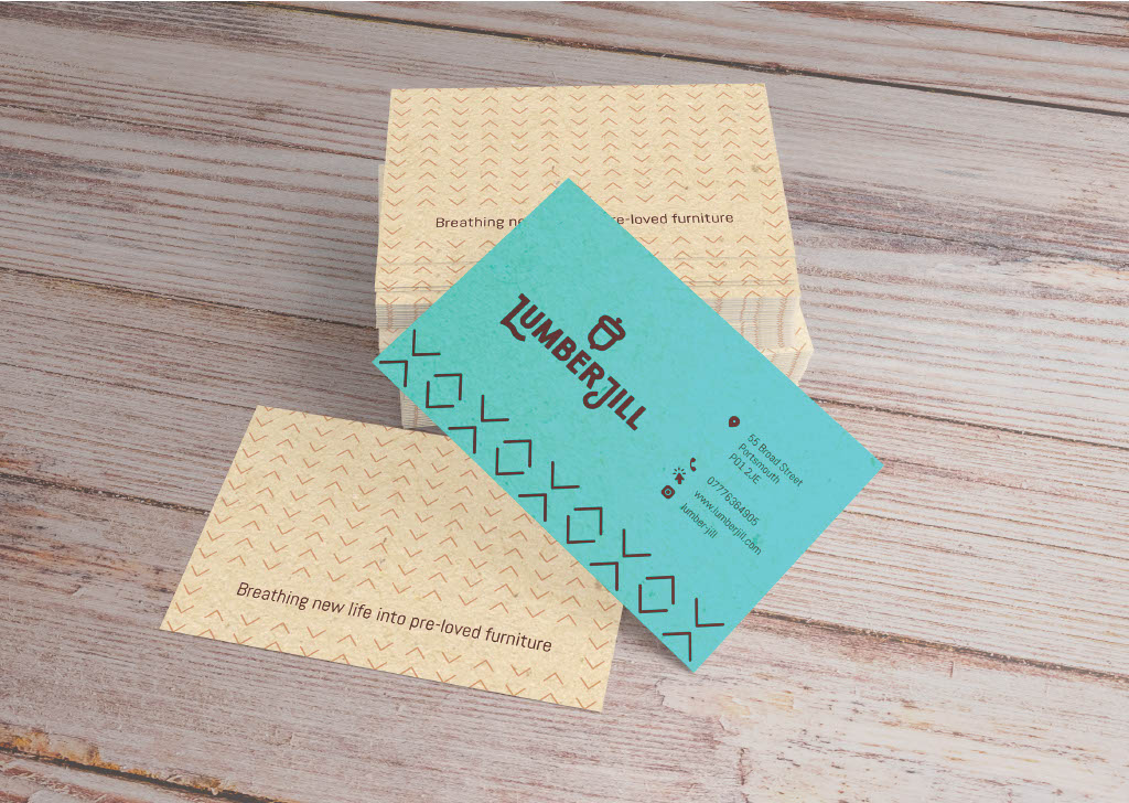
This brand and visual identity were created for a collective of female artists that renew and transform pre-loved furniture. With a strong entrepreneurial spirit, they have formed a group of likeminded people to transform their passion into a business. In a team of three designers, we’ve created a brand that reflects the collective’s love for DIY and power tools, with a personality that is Strong and Rustic. We’ve named the business LumberJill, a choice that embodies the client’s personality and adds a playful gender twist on an activity that might be seen as traditionally more associated with men than women.


The visual language is bold and strong while maintaining a hint of softness and playfulness to it as well, and presenting a charming retro feel. This is translated to the logomark, which features an all caps sans-serif font, subtly rounded block letterforms, individually customized. As a symbol of renewal and sustainability, the acorn was chosen, representing the planting of seeds for a better future. Derived from the oak tree, it signifies strength, power, and endurance, while also symbolizing the wood material used in the collective’s upcycled furniture pieces.
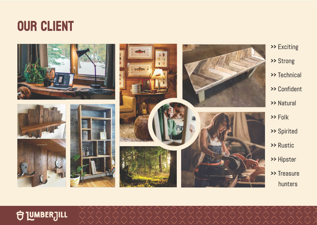

A palette of warm shades of brown was selected to evoke a cosy, welcoming feeling, resonating with the natural essence of wood. This was balanced with a vibrant teal colour, adding personality and a contemporary flair to the brand’s visual identity.
We sought to enhance the brand’s visual identity by introducing brand patterns that encapsulate its essence. Inspired by traditional folk art, which harmonizes with the Lumberjack theme and woodland cabin ambiance, we incorporated a chevron arrow shape as a supporting graphic element. This shape echoes the rugged charm of outdoor hiking trails, also suggesting movement and energy, complementing the brand’s personality.
Variations of the logo were also developed, ensuring consistent brand application across media of various shapes and sizes, as well as black and white scenarios.
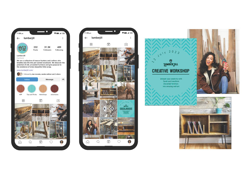
Given its potential for success on Instagram, an ideal platform to promote artists and creative businesses, we recommended establishing the brand’s main online presence through an Instagram account. The feed would feature a variety of content, including photos of finished products, work-in-progress posts and stories, tutorials, and lifestyle content reflecting the members of the collective and their creative journeys. Additionally, Instagram would serve as an ideal platform for promoting events and workshops, allowing the brand to engage with its audience in a dynamic and interactive way.
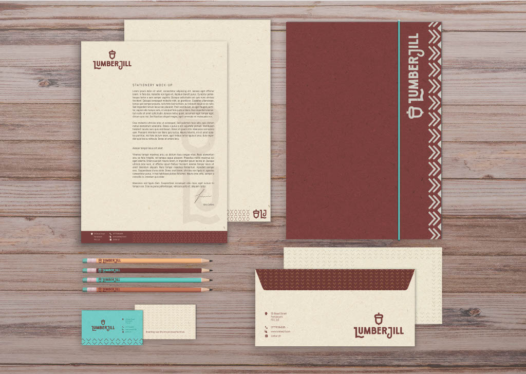
For the stationery, we opted for recycled paper, whose color and texture enhance the rustic ambiance of the brand while promoting sustainability, a core value. To maintain cost-effectiveness without sacrificing quality and visual impact, a single spot color was applied to the letterhead, envelopes, and folder. For the business card, two spot colors were utilized to ensure the vibrant teal, important for making a strong impact in this instance. The brand patterns and typography are used to support the visual language of the business, with contact details at hand where appropriate.
